Mapping Market Movements with Polygon.io and D3.js Treemap�
Oct 6, 2023
In this tutorial, we'll walk through creating a Treemap visualization of the current stock market conditions using Polygon's Snapshot API and the D3.js Treemap facilitated by the python-client library. The Snapshot API enables us to gather the latest market data for all US-traded stocks, which we then represent as color-coded nested rectangles in the Treemap, offering an interactive and detailed view of the market's status at a specific point in time.
D3.js is a powerful JavaScript library known for creating detailed, interactive visualizations, and when paired with Polygon.io’s financial market APIs, it enables us to create clear and detailed views of market movements in real-time.
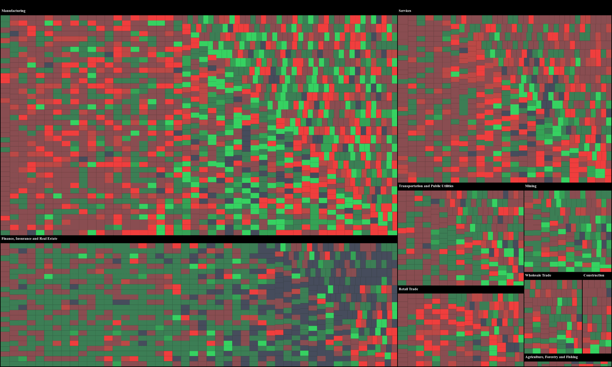
A visual snapshot of the market on October 5, 2023.
Polygon is a financial data platform that provides real-time and historical market data for Stocks, Options, Indices, Forex, and Crypto. Access to this data helps developers, investors, and financial institutions make informed decisions based on the latest market conditions.
Getting Started
Setting up and visualizing the stock market's current conditions is straightforward. All you'll need to do is clone the repository, secure an API key from Polygon.io, install the required Python library, launch the visualization server example, and then dive into the visualization through your web browser.
If you haven't already, register with Polygon.io and obtain an API key. Opt for at least a Stocks Starter subscription so that you’ll have Snapshot support. Store this key as an environment variable:
exportPOLYGON_API_KEY=YOUR_API_KEY_HERE
Next, install the necessary Python client:
pip install -U polygon-api-client
Change your directory to the Treemap's location and start the server:
cd examples/tools/treemap
python3 treemap_server.py
Once the server is running, open a web browser and navigate to:
http://localhost:8889
That’s it. You'll now see a Treemap that organizes over 4,000+ US-traded stocks into 10 distinct categories. Use the dropdown box in the top left corner to select different categories and delve deeper into the data.
Building Groups for the Treemap
One of the main challenges in visualizing stock market data is organization. When presented with thousands of companies operating in various sectors, how do we group companies operating in similar areas together? Specifically, how can we ensure that companies from related sectors, like automobile manufacturers, are clustered together in our visualization?
A simple solution is to use the Standard Industrial Classification (SIC) system. The SIC system assigns a four-digit numerical code to each company, categorizing it based on its primary line of business. These codes are hierarchical: the first two digits provide a broad classification, and the subsequent digits offer more detailed categorizations, allowing for clear distinctions between businesses.
For the purposes of clarity in our Treemap, we'll focus on the top-level classifications, representing the following 10 SIC groups:
Agriculture, Forestry and Fishing
Construction
Finance, Insurance and Real Estate
Manufacturing
Mining
Public Administration
Retail Trade
Services
Transportation and Public Utilities
Wholesale Trade
To obtain the SIC code for any company, we utilize Polygon's Ticker Details API:
While the SIC system offers codes for a wide range of business categories, we've chosen to streamline our visualization by limiting ourselves to the top 10 groups. This ensures that our Treemap remains fairly user-friendly and easy to understand, without cluttering the interface with too much granularity.
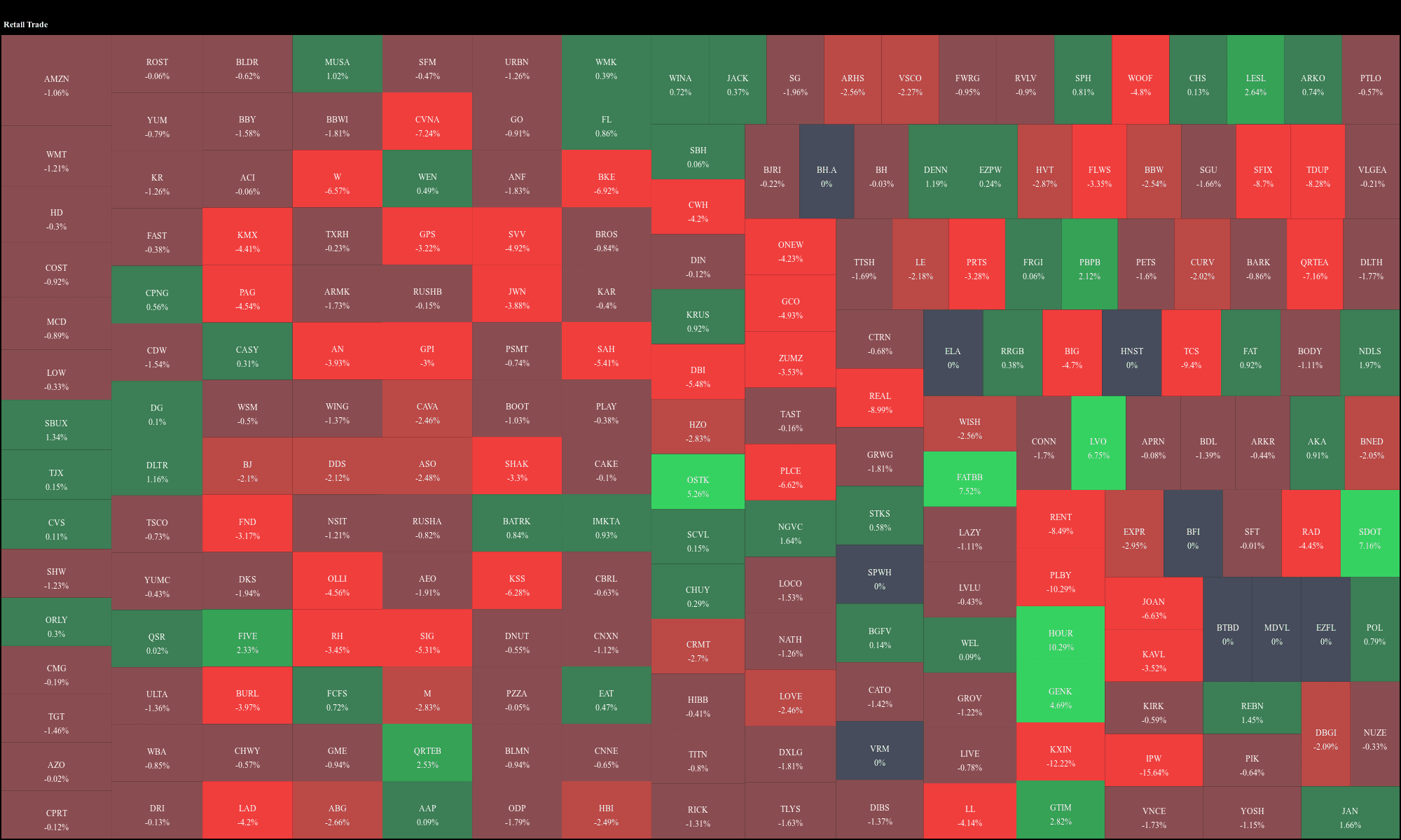
A visual snapshot of the Retail Trade group on October 5, 2023.
For those interested in the underlying mechanics, the repository you cloned contains a script,
polygon_sic_code_data_gatherer.py
. This script retrieves a snapshot of all ticker symbols, processes each one to obtain its SIC code via the Ticker Details API, and then saves these classifications into a file named
sic_code_groups.json
.
The following function maps SIC codes to their respective industry groups:
# https://en.wikipedia.org/wiki/Standard_Industrial_Classification# https://www.investopedia.com/terms/s/sic_code.aspdefsic_code_to_group(sic_code):"""
Maps a given SIC code to the industry group.
""" sic_code = int(sic_code)
if100 <= sic_code <= 999:
return"Agriculture, Forestry and Fishing"elif1000 <= sic_code <= 1499:
return"Mining"elif1500 <= sic_code <= 1799:
return"Construction"# Note: 1800-1999 not usedelif2000 <= sic_code <= 3999:
return"Manufacturing"elif4000 <= sic_code <= 4999:
return"Transportation and Public Utilities"elif5000 <= sic_code <= 5199:
return"Wholesale Trade"elif5200 <= sic_code <= 5999:
return"Retail Trade"elif6000 <= sic_code <= 6799:
return"Finance, Insurance and Real Estate"elif7000 <= sic_code <= 8999:
return"Services"elif9100 <= sic_code <= 9729:
return"Public Administration"elif9900 <= sic_code <= 9999:
return"Nonclassifiable"else:
returnNone
The logic of this SIC code-to-group enables us to transform a large dataset into a neatly structured visualization. This structured approach facilitates easy identification of market conditions, providing a snapshot of the market's overall health.
Building the Treemap
In this section, we'll outline the process of transforming raw market data into a visual treemap representation. We will begin by fetching market data, organizing it based on our previously defined SIC groupings, and then leveraging the D3.js library to visualize this data. Specifically, the size of each section in the treemap corresponds to a company's market_cap, while its color represents the stock's percentage change.
We begin by obtaining a snapshot of the market from Polygon.io using the Snapshot API. This snapshot gives us the latest information for each stock, including the ticker name and its percentage change for the day.
from polygon import RESTClient
client = RESTClient() # POLYGON_API_KEY environment variable is usedsnapshots = client.get_snapshot_all("stocks")
pct_changes = {
snapshot.ticker: round(snapshot.todays_change_percent, 2)
for snapshot in snapshots
}
We already solved a significant challenge in grouping companies from similar sectors by their top-level SIC codes. Using our previously constructed SIC mappings in the
sic_code_groups.json
file, we're able to achieve this. Larger companies, denoted by a bigger market_cap, will be represented with bigger rectangles in the treemap. This structure keeps our Treemap visualization user-friendly manner, and hopefully easy to understand what’s happening at a quick glance.
To transform our snapshot data into a structured format suitable for visualization, we use:
withopen("sic_code_groups.json", "r") as file:
sic_code_groups = json.load(file)
data = defaultdict(lambda: defaultdict(list))
for sic_code, group_data in sic_code_groups.items():
parent = group_data["sic_description"]
for company in group_data["companies"]:
ticker = company["ticker"]
weight = company["weight"]
pct_change = pct_changes.get(ticker, 0.0)
data[parent][ticker].append(
{"name": ticker, "weight": weight, "change": pct_change}
)
data = dict(data)
output = {"name": "root", "children": []}
for parent, children in data.items():
parent_dict = {"name": parent, "children": []}
for child, companies in children.items():
total_change = sum(company["change"] for company in companies)
avg_change = total_change / len(companies) if companies else0 avg_change = round(avg_change, 2)
child_dict = {
"name": child,
"change": avg_change,
"children": companies,
}
parent_dict["children"].append(child_dict)
output["children"].append(parent_dict)
With our data structured, the next step is to visually represent it as a D3.js Treemap. The logic we'll explore here offers a top-level view of how this is built. But, to really see how it works it is worth exploring the full code provided in the example repository.
A visual snapshot of the Transportation and Public Utilities group on October 5, 2023.
The
treemap_server.py
script has predefined HTML and Javascript code that serves the Treemap visualization and also acts as a data provider, retrieving and processing the snapshot data in real-time. A neat feature of the visualization is an interactive dropdown selector in the top left corner. By using this, you can filter the treemap to focus on specific industry categories, offering a much more detailed view into specific sectors.
Finally, to make this visualization accessible, a simple HTTP server is set up through Python. Running the tool and accessing http://localhost:8889 on a browser will present the treemap. This visualization fetches and displays data in real-time every time it's loaded, ensuring users always get the freshest snapshot of the market.
Next Steps
Understanding market movements can be complex given the large amount of data. Yet, by combining the capabilities of Polygon.io with the interactive visualization of D3.js, we managed to represent a snapshot of the market in an easy to understand way. Whether you're a developer, a financial analyst, or someone with a keen interest in the stock market, having tools like this Treemap at your disposal can greatly enhance your ability to quickly grasp market conditions. If you've been thinking about building a similar visualization tool, we hope this tutorial offers a path forward.
Polygon.io is excited to announce a new partnership with Benzinga, significantly enhancing our financial data offerings. Benzinga’s detailed analyst ratings, corporate guidance, earnings reports, and structured financial news are now available through Polygon’s REST APIs.
This tutorial demonstrates how to detect short-lived statistical anomalies in historical US stock market data by building tools to identify unusual trading patterns and visualize them through a user-friendly web interface.