In this tutorial, we will look at examples of how stocks move in relation to one another by building several correlation matrices using Python for data analysis and Polygon’s python-client library to fetch market data. The underlying idea is that by diversifying across uncorrelated assets, you can effectively reduce portfolio risk, and mitigate the impact of market fluctuations. Finding stocks that move together and those that do not is a crucial aspect of solving this problem.
Polygon.io is a financial data platform that provides both real-time and historical market data for Stocks, Options, Indices, Forex, and Crypto. With access to this information, developers, investors, and financial institutions can gain valuable insights and make informed decisions.
What is Stock Correlation
Correlation is a statistical measure that indicates the extent to which two or more variables move in relation to each other. In the context of stocks, correlation can help us understand the degree to which the prices of two or more stocks move together. A positive correlation indicates that the stocks tend to move in the same direction, while a negative correlation means they move in opposite directions. By identifying uncorrelated stocks, traders can minimize risk and build a more balanced portfolio.
Here's a high-level workflow of how to calculate the correlation between stocks:
Gather historical price data for the stocks you are interested in analyzing with Polygon.io.
Calculate the daily returns using Python for each stock via the percentage changed.
Compute the correlation matrix using the pandas library built-in corr() method (Pearson correlation coefficient), which measures the linear relationship between two variables.
Visualize the correlation matrix using a heatmap, which helps better understand the relationships between stocks.
By following these steps, you can fairly quickly calculate and visualize the correlation between stocks, that could help you build a well-diversified portfolio that minimizes risk.
Computing a Correlation Matrix
Now, let's walk-through this workflow step-by-step and look at what is needed in detail. The initial step involves gathering historical price data for the stocks of interest, which can be accomplished using Polygon.io's Aggregates (Bars) API using the client-python library. To access the API, you will need an API key. If you do not already have one, you can sign up for free on the website to obtain it. Once you have your API key, you can proceed with the analysis.
The specific stock symbols and the date range are defined as variables in our script, and these can be tailored as per your specific requirements. We have the complete code example available via the client-python repo (link to script) but we will look at snippets from the script as we walk through it.
Once we have the historical price data, we calculate the daily returns for each stock. This can be done using the percentage change method which gives us the rate of return from one trading day to the next.
Next, we compute the correlation matrix using the corr() method provided by the pandas library. This method computes the Pearson correlation coefficient, which measures the linear relationship between two variables.
The output of this step is a correlation matrix, a square table that shows the correlation coefficients between each pair of stocks. Each cell in the table shows the correlation between two stocks: a value of 1 means a perfect positive correlation, a value of -1 means a perfect negative correlation, and a value of 0 means no correlation. The diagonal line of 1s from the top left to the bottom right represents each stock's correlation with itself, which is always 1.
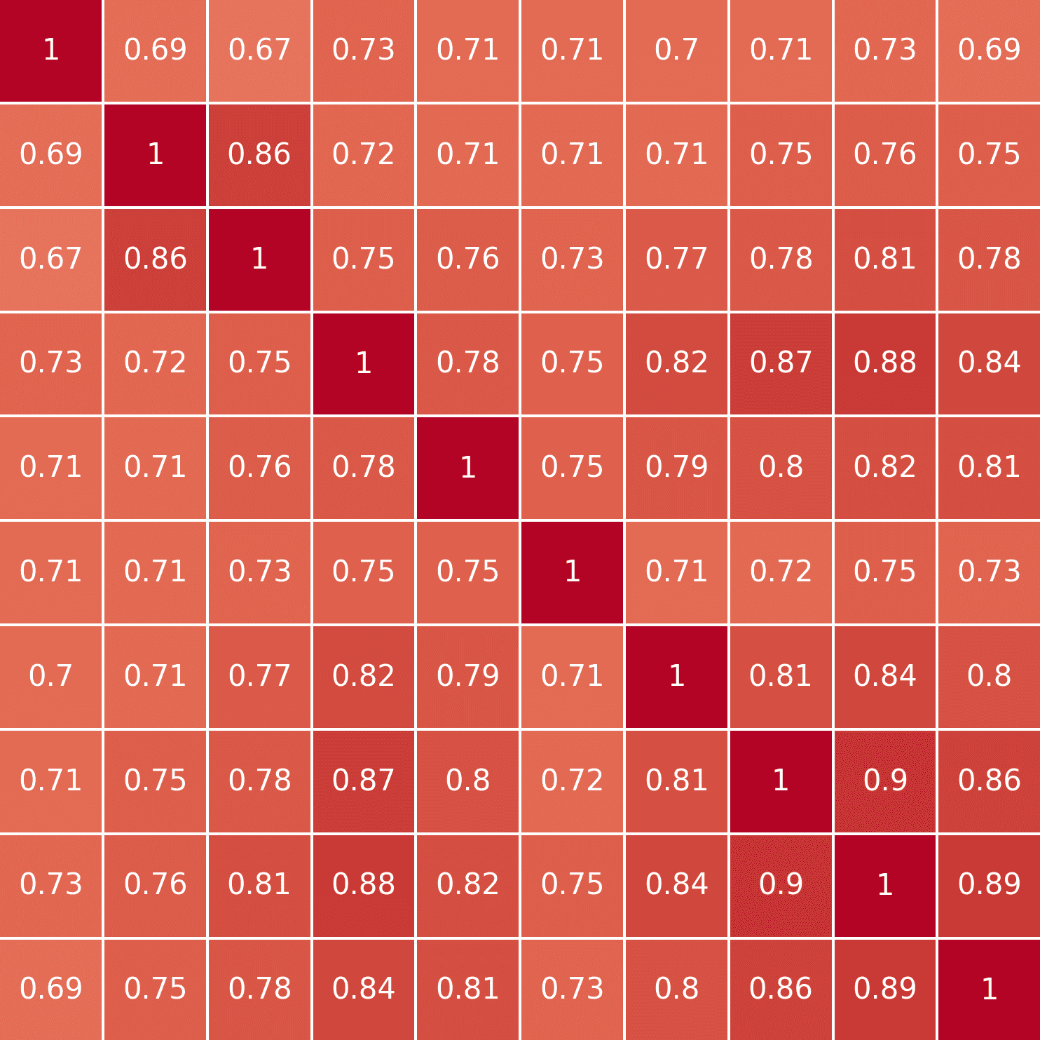
INTC AMD NVDA TXN QCOM MU AVGO ADI MCHP NXPI
INTC1.0000000.6882250.6681480.7288490.7054440.7053840.7040720.7070940.7256830.693339AMD0.6882251.0000000.8630820.7237550.7142760.7129580.7123810.7511920.7637860.752658NVDA0.6681480.8630821.0000000.7510070.7619490.7292330.7673730.7802620.8129280.783573TXN0.7288490.7237550.7510071.0000000.7789920.7472240.8236590.8714400.8771410.842469QCOM0.7054440.7142760.7619490.7789921.0000000.7485380.7876400.7980450.8193670.812557MU0.7053840.7129580.7292330.7472240.7485381.0000000.7055170.7161190.7539120.730331AVGO0.7040720.7123810.7673730.8236590.7876400.7055171.0000000.8089280.8398740.801082ADI0.7070940.7511920.7802620.8714400.7980450.7161190.8089281.0000000.9017580.857143MCHP0.7256830.7637860.8129280.8771410.8193670.7539120.8398740.9017581.0000000.889236NXPI0.6933390.7526580.7835730.8424690.8125570.7303310.8010820.8571430.8892361.000000
Finally, to better understand the relationships between the stocks, we visualize the correlation matrix using a heatmap. The seaborn library provides an easy way to create this heatmap. These stocks are likely to be highly correlated due to being in the technology sector, specifically in the sub-industry of semiconductors.
plot_correlation_heatmap(correlation_matrix)
The resulting image, provides a visually intuitive representation of the correlation matrix, so that you can quickly identify both highly correlated and uncorrelated stocks. The heatmap's color scale ranges from -1 (indicating a perfect negative correlation) to 1 (indicating a perfect positive correlation), with the varying shades of color in between representing the degree of correlation.
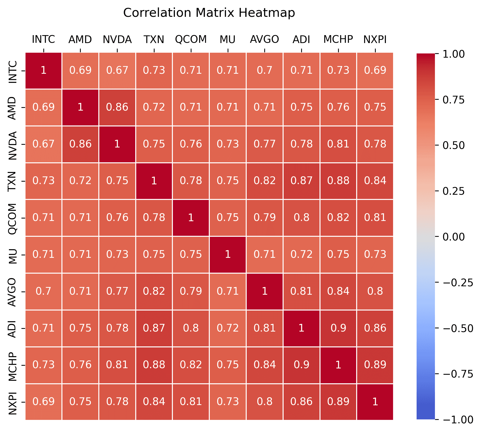
Here is another example of ten stocks selected across a diverse range of industries including automotive, healthcare, energy, consumer discretionary, financials, technology, consumer staples, and industrials. Given this industry diversity, these stocks are likely to be uncorrelated, as they are exposed to different market forces, economic trends, and sector-specific risks.
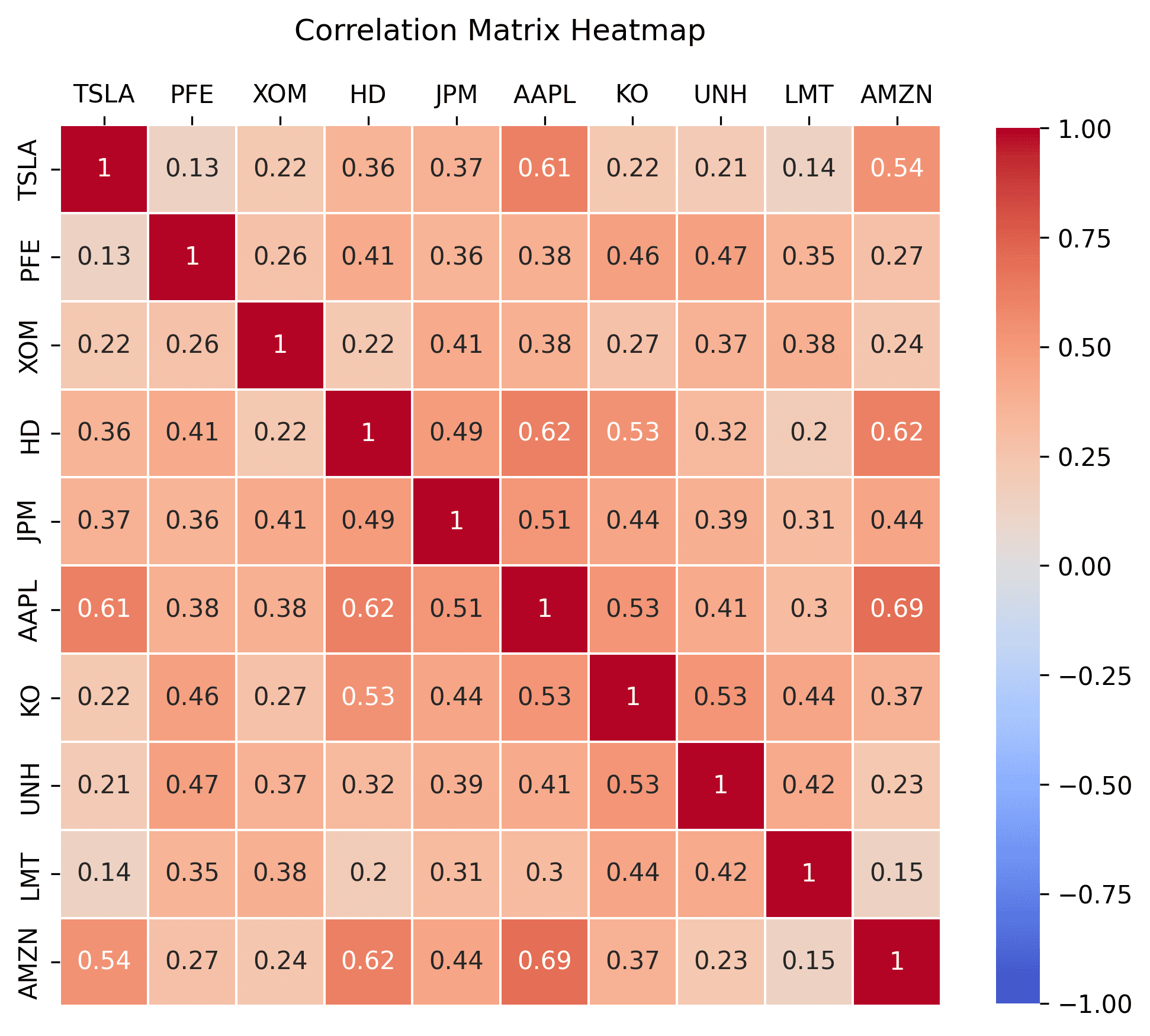
Here is another example, of stocks that are divided into two distinct groups: technology and oil. The technology group are likely to be highly correlated due to their shared sector influences. Conversely, the oil group, are also likely to move in tandem due to shared influences like global oil prices, energy demand, and environmental regulations. However, given the distinct market forces and sector-specific risks affecting technology and oil stocks, these two groups are expected to be less correlated with each other.
Through these steps, we can analyze the correlation between different stocks and build a diverse portfolio to manage risk and inform investment strategies.
Next Steps
With a correlation matrix and heatmap visualization, you can easily identify how correlated two or more stocks are and diversify your portfolio to reduce risk. Keep in mind that correlations may change over time, so this might be an interesting idea to explore and see how correlation values change over time.
In conclusion, understanding the correlation between stocks is crucial for building a well-diversified and low-risk portfolio. By utilizing this example code that uses Polygon.io's historical stock Aggregates (Bars) API via the client-python package, along with the power of other Python libraries, you can efficiently analyze and visualize correlations to make more informed investment decisions.
Polygon.io is excited to announce a new partnership with Benzinga, significantly enhancing our financial data offerings. Benzinga’s detailed analyst ratings, corporate guidance, earnings reports, and structured financial news are now available through Polygon’s REST APIs.
This tutorial demonstrates how to detect short-lived statistical anomalies in historical US stock market data by building tools to identify unusual trading patterns and visualize them through a user-friendly web interface.